
Technostok
Designed in 2022. Still on the shop front in 2026.
Two logos for one tooling group: Technostok and its parent company, Darantasia. Made in collaboration with Laconic.
Almost five years on, nothing has been swapped out
A logo earns its fee when the client never needs another one.
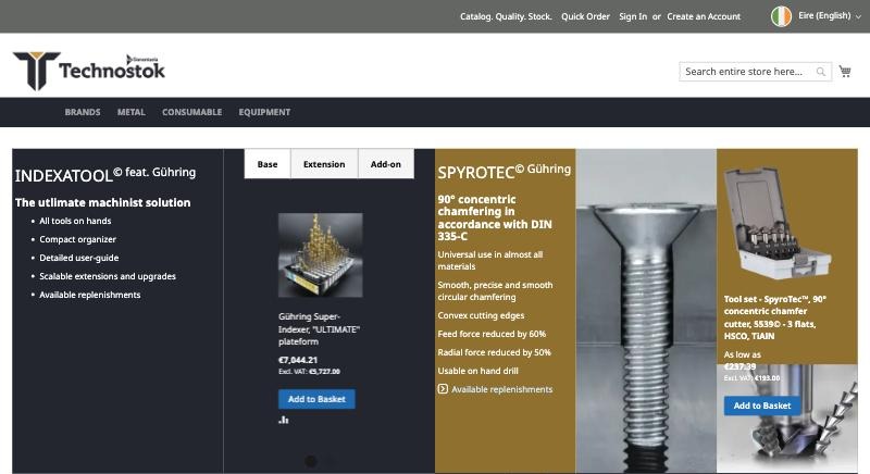
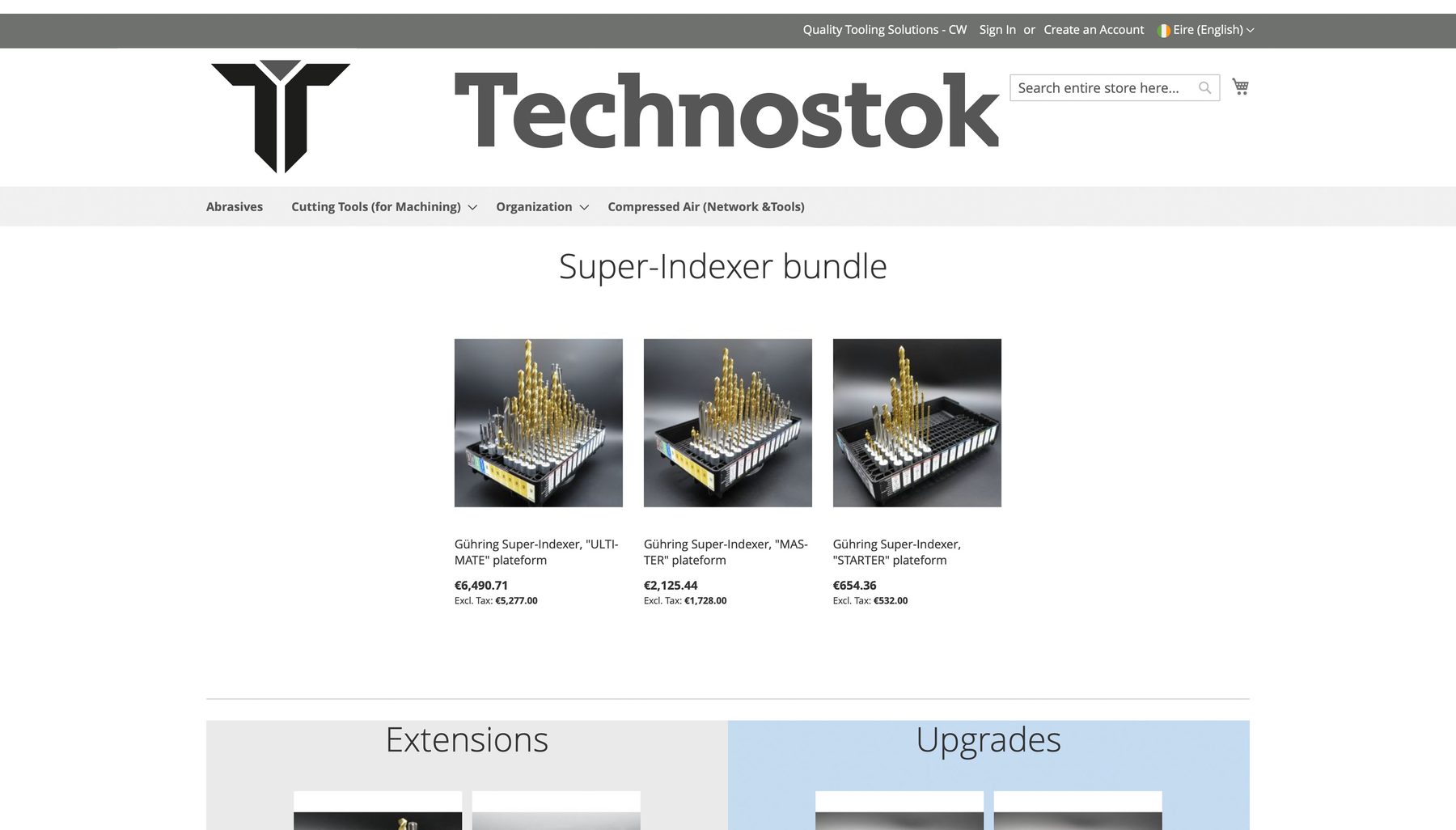
I checked on 11 November 2026. The Technostok logo sits in the header of every country store, from Ireland to Norway, and the double T is the browser icon on each one.
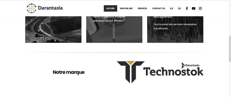
Darantasia uses its own logo on the company site and presents Technostok there as “Notre marque”, our brand.
country stores carrying the logo and favicon
logos in one family: the store and its parent
The job
A mark for a shop that sells cutting tools
Technostok sells drill sets, chamfer cutters and broaching tools online to workshops across Europe.
The logo had two places to work first: a narrow store header and the side of a shipping box. So every route was mocked up on both before anything was chosen.
January 2022
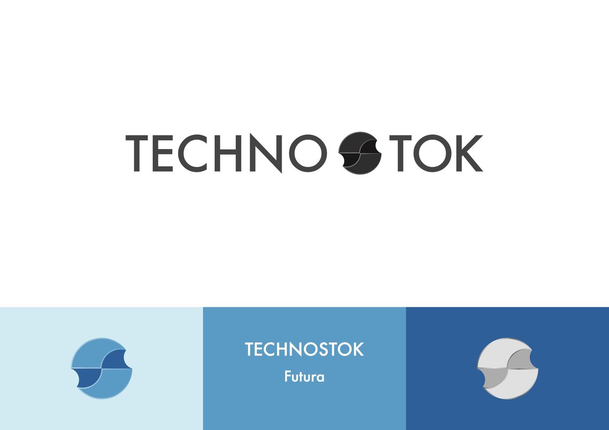
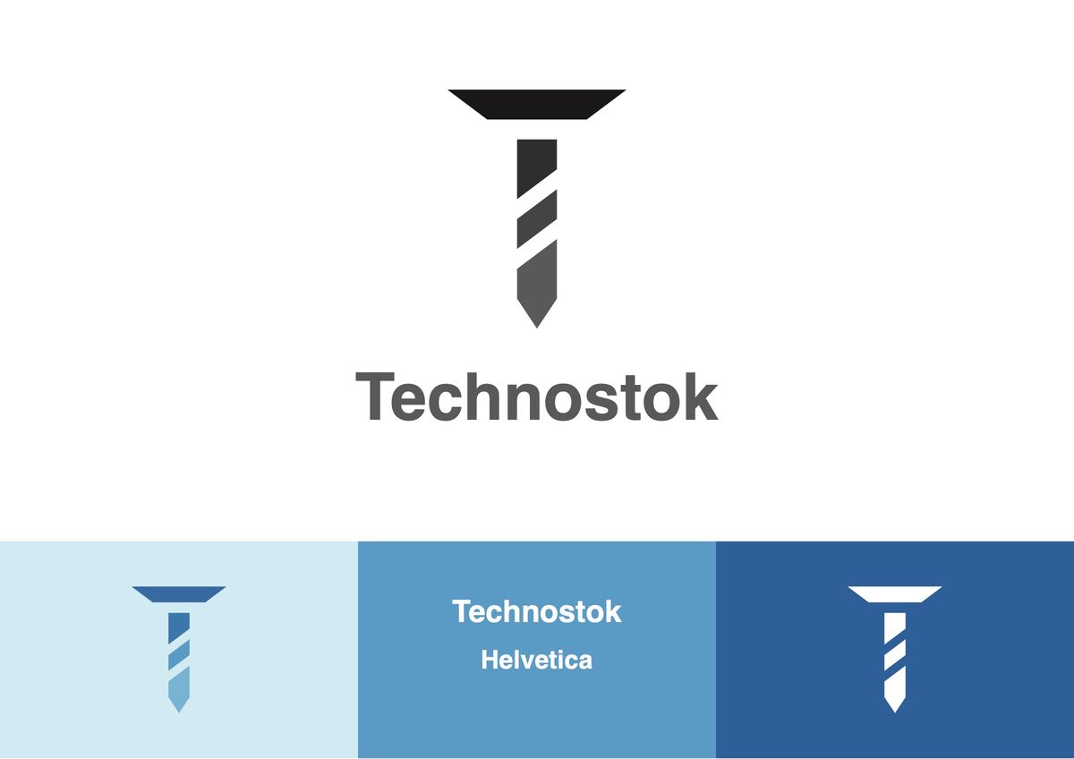
Four routes, four typefaces
Each route had its own idea, its own type and the same three tests: on white, on a photograph, on a box.
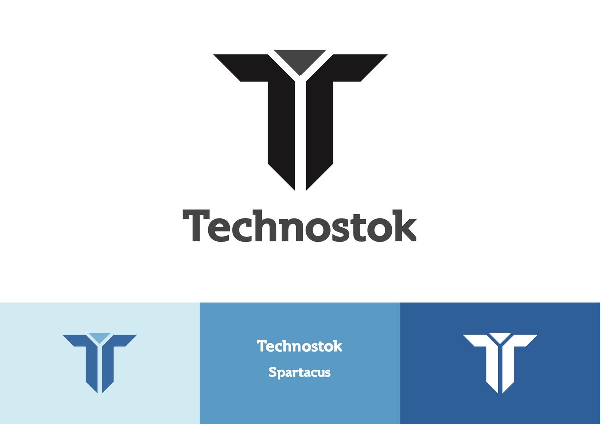
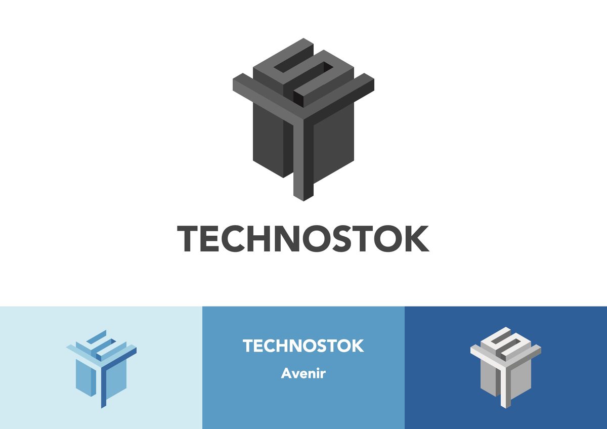
The one that stuck
Solid enough for a box, simple enough for a favicon
Route three won. The double T holds its shape at any size, down to the 33 pixel icon in a browser tab.
The blue from the presentation was dropped for charcoal, and the notch became the one place the gold appears.
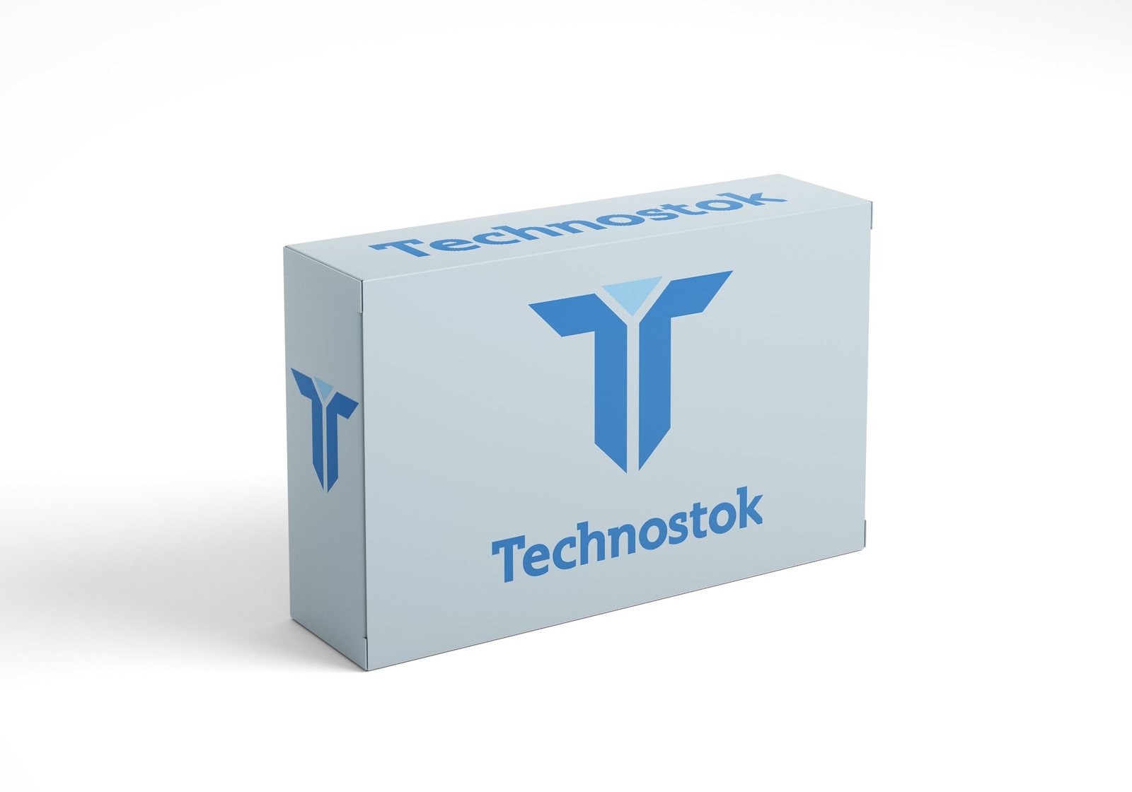
February 2022
A short guide the client could actually follow
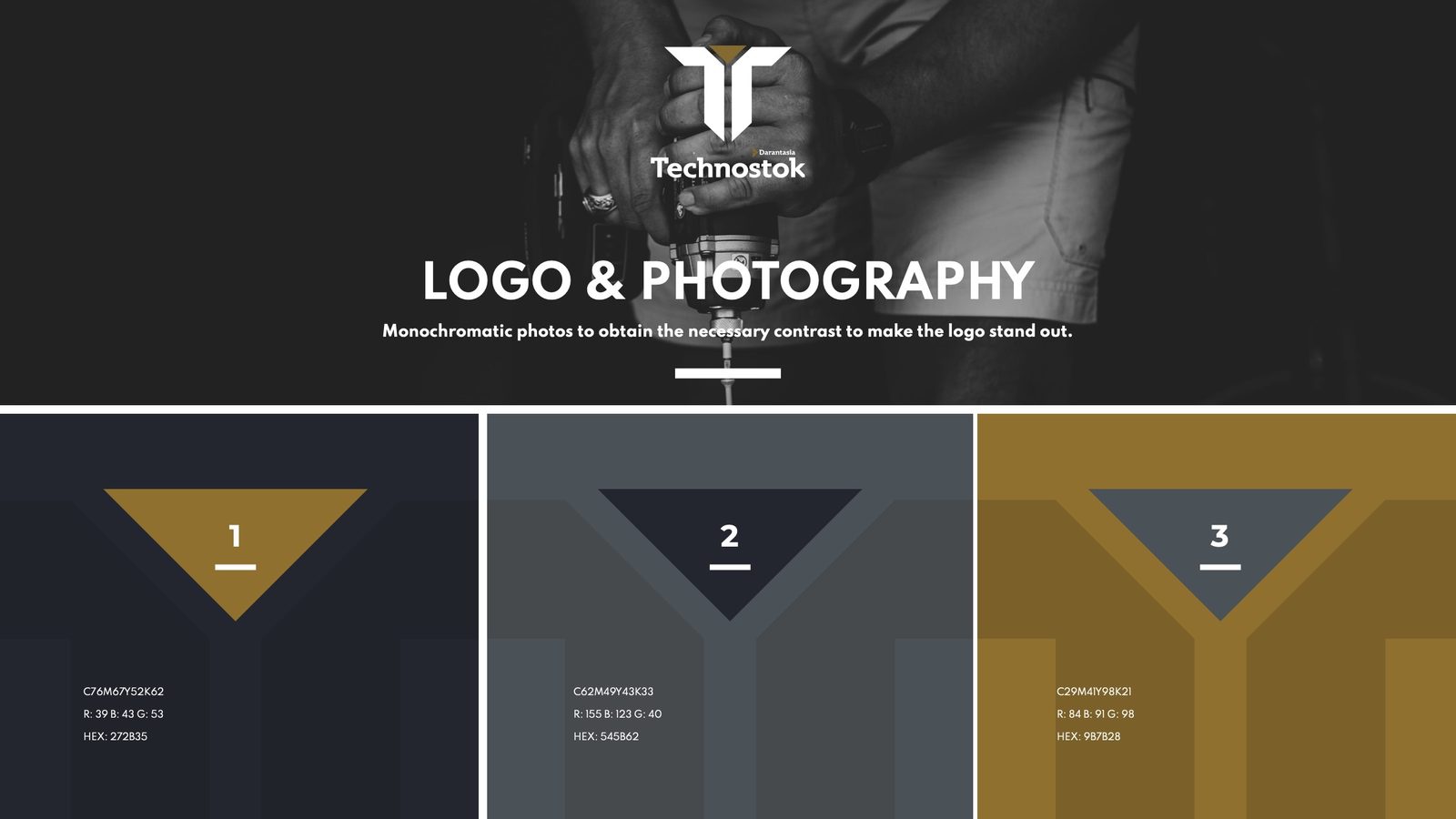
Three colours, two typefaces, three rules.
Spartacus for the name, Spartan for everything else. Photography stays monochrome so the logo always has the contrast it needs.
The parent brand
Darantasia, drawn as a network
Darantasia distributes tools and technical equipment across Europe, the Middle East and Africa.
Its logo shares the charcoal, the gold and the heavy wordmark with Technostok, so the two read as one family. A small “by Darantasia” tag on the store logo ties them together.

Next project
 ← All projects